1
Pick your sizes
The default set is iPhone 1206 × 2622 and 1320 × 2868, iPad 13" 2064 × 2752 and Play phone 1080 × 1920.
iPhone 6.3"iPhone 6.9"iPad 13"Play phone
Design once and Storepanes fits the layout to each iPhone, iPad and Android size the stores accept.
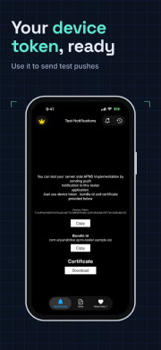
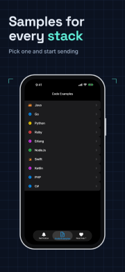
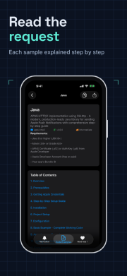
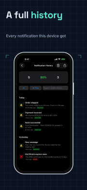
Example: one template set at iPhone size.
How it works
The default set is iPhone 1206 × 2622 and 1320 × 2868, iPad 13" 2064 × 2752 and Play phone 1080 × 1920.
Captions, frames and backgrounds adapt to each aspect ratio, with per-size tweaks when you need them.
Every size lands in its own folder in one ZIP.
Details
Sizes match Apple's and Google's published screenshot specifications.
Add iPad 13" and Android tablet sizes, portrait or landscape.
Warnings flag cut-off titles and captures that don't fit a size.
Start free, or read the screenshot sizes guide first.